Color Palette Ideas for Stunning Home Decor Transformations
Color plays a pivotal role in home decor, serving not only as a visual element but also as a means of expressing personal style and influencing the mood of a space. The right color palette can transform a room, making it feel more inviting, spacious, or serene. In this article, we will explore seven distinct color palette ideas that cater to various decor styles, providing inspiration for anyone looking to refresh their living environment.
Understanding how different colors interact and the emotional responses they evoke is key to creating a harmonious and aesthetically pleasing home. By showcasing these palettes, we aim to help you discover how color can enhance your home and reflect your unique taste.
Understanding Color Theory
The Basics of Color
To effectively use color in home decor, it's essential to grasp the basics of color theory.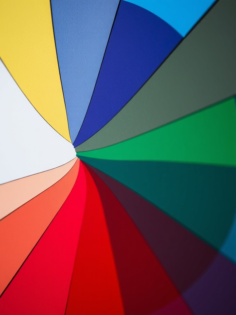
Colors are classified into three categories:
- Primary Colors: Red, blue, and yellow. These colors cannot be created by mixing other colors.
- Secondary Colors: Green, orange, and purple. These are formed by mixing primary colors.
- Tertiary Colors: These are created by mixing primary and secondary colors, resulting in shades like red-orange and blue-green.
Color Wheel and Its Applications
The color wheel is a fundamental tool in color theory that helps in creating harmonious palettes. By understanding the relationships between colors, you can select combinations that are visually appealing:
- Complementary Colors: Colors opposite each other on the wheel, such as blue and orange, create vibrant contrasts.
- Analogous Colors: Colors next to each other, like blue, blue-green, and green, produce serene and comfortable designs.
- Triadic Colors: Three colors evenly spaced on the wheel, such as red, yellow, and blue, offer a balanced yet dynamic look.
The Psychology of Color
Colors can evoke specific emotions and feelings, influencing how we perceive and interact with our spaces. For instance:
- Blue: Often associated with calmness and tranquility.
- Red: A stimulating color that can increase energy levels.
- Yellow: Linked to happiness and optimism.
Consider the emotional impact of colors when choosing your palette to create the desired atmosphere.
Classic Neutrals: Timeless Elegance
Shades of White, Beige, and Gray
Neutral colors serve as a versatile backdrop, allowing for a wide range of decor styles.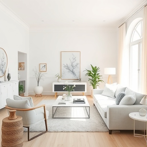
Shades of white, beige, and gray can enhance natural light and make spaces feel larger and more open.
Accents and Textures
To add depth to a neutral palette, consider incorporating various textures. For example:
- Use plush fabrics like velvet or faux fur for pillows.
- Incorporate wooden elements to add warmth.
- Add metallic accents for a touch of elegance.
Ideal Styles
Neutral palettes work exceptionally well with various decor styles, including:
- Modern Minimalism
- Scandinavian
- Contemporary
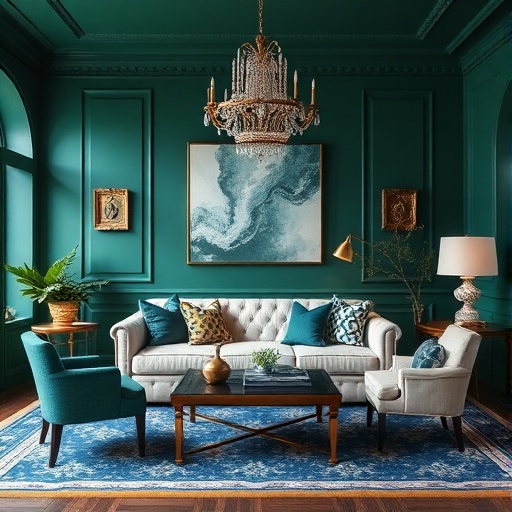
Bold and Vibrant: Making a Statement
Jewel Tones
Rich and vibrant colors like emerald green, sapphire blue, and ruby red can make a striking statement in any room. These jewel tones add drama and sophistication.
Pairing with Neutrals
When using bold colors, balance is key. Pairing vibrant hues with neutral elements can help create a cohesive look. Consider the following tips:
- Use bold colors for accent walls or furniture.
- Incorporate neutral tones in textiles and accessories.
- Keep flooring and larger furniture pieces neutral to ground the space.
Ideal Styles
Bold palettes are perfect for styles such as:
- Bohemian
- Eclectic
- Art Deco
Soft Pastels: Subtle Serenity
Light Blues, Pink, and Mint Green
Pastel colors create a calming and serene environment.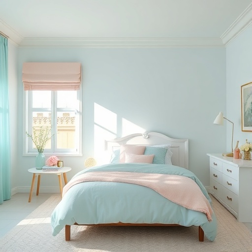
Light blues, soft pinks, and mint greens are popular choices for fostering tranquility.
Layering Pastels
Combining pastels with white or light woods can enhance their subtle beauty. Techniques to consider include:
- Mixing different pastel shades for a cohesive look.
- Incorporating light wood furniture to add warmth.
- Using white accents to keep the space airy.
Ideal Styles
Soft pastels work beautifully with styles such as:
- Cottage
- Shabby Chic
- French Country
Earthy Tones: Nature-Inspired Warmth
Browns, Greens, and Terracotta
Earthy tones create a grounded and comforting atmosphere.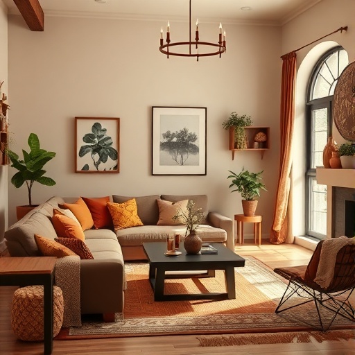
Colors like browns, greens, and terracotta connect us to nature, making spaces feel warm and inviting.
Incorporating Natural Materials
Enhancing earthy palettes with natural materials can elevate the overall design. Consider these suggestions:
- Use reclaimed wood for furniture and accents.
- Incorporate stone elements in decor.
- Choose textiles made from natural fibers like cotton or linen.
Ideal Styles
Earthy tones harmonize well with styles such as:
- Rustic
- Organic Modern
- Farmhouse
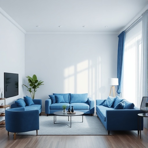
Monochromatic Magic: One Color, Many Shades
Exploring Variations of a Single Color
A monochromatic palette uses different shades, tints, and tones of one color to create a sophisticated and cohesive look. This approach allows for creativity while maintaining unity.
Creating Depth and Interest
To prevent a monochromatic scheme from feeling flat, focus on layering and mixing textures. Tips include:
- Incorporate various materials, such as glass, wood, and fabric.
- Utilize different patterns to add visual interest.
- Vary the intensity of the color across different elements.
Ideal Styles
Monochromatic palettes are well-suited for styles like:
- Contemporary
- Industrial
- Modern
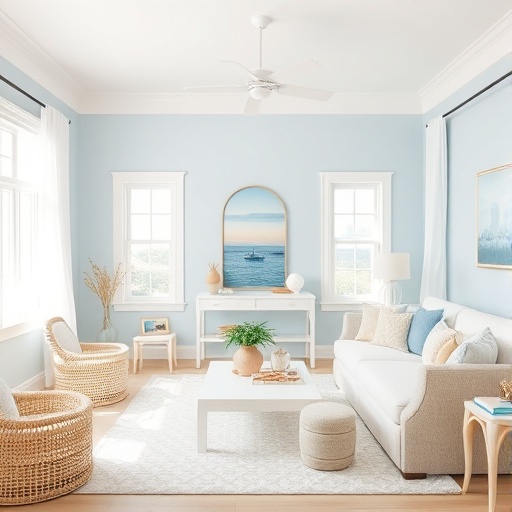
Coastal Vibes: Breezy Blues and Sandy Neutrals
Ocean-Inspired Colors
Coastal decor often features soft blues, sandy beiges, and seafoam greens, evoking a sense of calm and relaxation reminiscent of the beach.
Textures and Patterns
Incorporating nautical elements and textures can enhance coastal themes. Ideas include:
- Using striped patterns for textiles.
- Incorporating driftwood or nautical decor.
- Choosing light, airy fabrics for curtains and upholstery.
Ideal Styles
Coastal palettes are ideal for styles such as:
- Beach House
- Nautical
- Coastal Cottage
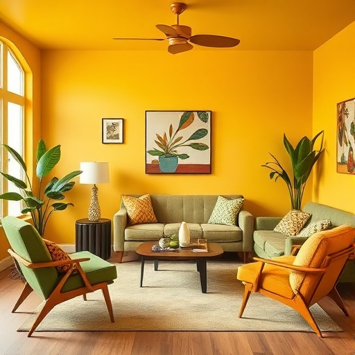
Vintage Charm: Retro Color Combinations
Bold Retro Colors
Colors like mustard yellow, avocado green, and burnt orange can bring a sense of nostalgia and warmth to a space, creating a retro vibe.
Mixing Old and New
Blending vintage furniture with modern decor can create a unique and dynamic look. Tips for achieving this include:
- Incorporating vintage pieces as focal points.
- Pairing retro colors with contemporary accessories.
- Maintaining a balance between old and new styles for harmony.
Ideal Styles
Retro palettes work well with styles such as:
- Mid-Century Modern
- Vintage
- Retro Chic
Conclusion
Selecting the right color palette is essential in creating a cohesive and inviting home. By understanding the principles of color theory and exploring different palettes, you can discover styles that resonate with your personal taste. Don't be afraid to experiment with various combinations; the right colors can truly transform a space and influence the overall atmosphere.
Recap
From classic neutrals to bold jewel tones, each color palette offers unique benefits and styles. Take the time to find the palette that speaks to you and reflects your personality.
Key Takeaways
- Color significantly impacts mood and perception of space.
- Understanding color theory helps in creating harmonious palettes.
- Neutral colors provide versatility, while bold colors make a statement.
- Experimenting with textures can enhance any color palette.
- Each decor style has ideal color palettes that complement its aesthetics.
FAQ
What is the best way to choose a color palette for my home?
Start by considering the mood you want to create and the decor style you prefer. Use a color wheel to explore harmonious combinations and test samples in your space.
Can I mix different color palettes in one room?
Yes, you can mix different color palettes, but it's essential to maintain some cohesion. Use a unifying element, such as a neutral base or a common accent color, to tie the look together.
What are some popular colors for small spaces?
Light and soft colors, such as whites, light grays, and pastels, can make small spaces feel larger and more open. Pairing these with mirrors can further enhance the effect.
How do I incorporate bold colors without overwhelming the space?
Use bold colors as accents rather than the main color. Consider painting an accent wall or using bold colors in accessories like pillows, artwork, or rugs.
Are there color palettes that are universally appealing?
While personal taste varies, neutral palettes with soft colors are often considered universally appealing as they create a calm and inviting atmosphere.